1. styled-reset
styled-reset은 CSS 초기화 라이브러리로, 브라우저별 기본 스타일을 초기화할 수 있습니다.
- 설치
npm install styled-reset
yarn add styled-reset
- 사용법
// src/App.js
import React from 'react'
import Routers from './components/Routers'
import { Reset } from 'styled-reset'

const App = () => {
    return (
        <>
            <Reset /> {/* 초기화 */}
            <Routers />
        </>
    )
}

export default App
2. styled-components
styled-components는 CSS in JS 라이브러리로, JavaScript 파일 안에 CSS를 작성할 수 있습니다. 이를 통해 컴포넌트 스타일링을 더욱 편리하게 할 수 있습니다.
- 설치
npm install styled-components
yarn add styled-components
- 사용법
styled 함수를 사용해 스타일을 정의하고, 컴포넌트를 생성합니다. 생성한 스타일드 컴포넌트는 일반 컴포넌트처럼 사용할 수 있습니다.
// src/components/layout/Footer.jsx
import { Link } from 'react-router-dom'
import styled from 'styled-components'

const Footer = () => {
    return (
        <FooterWrap>
            <CorpList>
                <li>
                    <Link to="/">이용약관</Link>
                </li>
                <li>
                    <Link to="/">개인정보처리방침</Link>
                </li>
                <li>
                    <Link to="/">고객센터</Link>
                </li>
            </CorpList>
            <div className="mt-10 text-gray-600">Copyright © company. All rights reserved.</div>
        </FooterWrap>
    )
}

const FooterWrap = styled.footer`
    display: flex;
    flex-direction: column;
    align-items: center;
    padding: 2rem;
    background-color: lightblue;
`

const CorpList = styled.ul`
    display: flex;
    li {
        &::before {
            content: '|';
            margin: 0 2px;
        }
        &:first-child::before {
            content: '';
        }
    }
    a {
        color: red;
        padding: 2rem;
    }
`

export default Footer
- GlobalStyle 적용
createGlobalStyle 함수를 사용해 전역 스타일을 적용할 수 있습니다.
- google font 적용하여
noto sans kr폰트를 사용합니다. - 구글폰트 사이트에서 폰트를 찾아 링크를 가져옵니다.
<link href="https://fonts.googleapis.com/css2?family=Noto+Sans+KR:wght@100..900&display=swap" rel="stylesheet" />//theme/globalStyles.js
import { createGlobalStyle } from 'styled-components'
const GlobalStyle = createGlobalStyle`
* {
box-sizing: border-box;
}
body {
font-size: 16px;
line-height: 1.5;
font-family: 'Noto Sans KR', 'Malgun Gothic', '맑은 고딕', sans-serif;
color: $txtDefult;
}
/* desktop */
@media screen and (min-width: 1280px) {
body {
font-size: 16px;
}
}
hr {
display: none;
}
input[type='password'] {
font-family: 'Malgun Gothic';
}
/* 웹폰트 사용시 점이 안보임 - 기본 폰트 사용 */
/* skipnavigation */
#u-skip {
position: relative;
z-index: 3000;
a {
position: absolute;
top: -35px;
left: 0;
right: 0;
display: inline-block;
padding: 7px 10px 5px;
background: #333;
color: #fff;
text-decoration: none;
text-align: center;
opacity: 0;
&:focus {
top: 0;
opacity: 1;
z-index: 1000;
}
}
}
.blind, caption, legend {
overflow: hidden;
position: absolute;
width: 0;
height: 0;
line-height: 0;
text-indent: -9999px;
}
`
export default GlobalStyle// src/App.js
import React from 'react'
import Routers from './Routers'
import { Reset } from 'styled-reset'
import GlobalStyle from './theme/globalStyles'
const App = () => {
return (
<>
<Reset />
<GlobalStyle />
<Routers />
</>
)
}
export default App- ThemeProvider 사용
ThemeProvider 컴포넌트를 사용해 테마를 전역으로 적용할 수 있습니다.
//theme/theme.js
const theme = {
    colors: {
        primary: '#0041da',
        secondary: '#ffcd00',
        red: '#ff0000',
        white: '#fff',
        black: '#000',
        txtDefault: '#222',
        gray: {
            100: '#f7fafc',
            200: '#edf2f7',
            300: '#e2e8f0',
            400: '#cbd5e0',
            500: '#a0aec0',
            600: '#718096',
            700: '#4a5568',
            800: '#2d3748',
            900: '#1a202c',
        },
    },
    breakpoints: {
        sm: '480px',
        md: '768px',
        lg: '992px',
        xl: '1280px',
        xxl: '1440px',
    },
}

export default theme
// src/App.js
import React from 'react'
import { ThemeProvider } from 'styled-components'
import Routers from './Routers'
import { Reset } from 'styled-reset'
import GlobalStyle from './theme/globalStyles'
import theme from './theme/theme'
const App = () => {
return (
<ThemeProvider theme={theme}>
<Reset />
<GlobalStyle />
<Routers />
</ThemeProvider>
)
}
export default App// src/components/layout/Footer.jsx
import styled from 'styled-components'
(...)
const FooterWrap = styled.footer`
(...)
background-color: ${(props) => props.theme.colors.gray[100]};
`
const CorpList = styled.ul`
(...)
a {
color: ${(props) => props.theme.colors.secondary};
padding: 2rem;
}
`- 공용 Button 컴포넌트
사이트 전체에서 사용할 Button 컴포넌트를 만들어 사용할 수 있습니다.
// src/components/common/Button.jsx
import styled from 'styled-components'

const Button = styled.button`
    padding: 10px 20px;
    border: none;
    background-color: ${(props) => (props.primary ? props.theme.colors.black : props.theme.colors.white)};
    color: ${(props) => (props.primary ? props.theme.colors.white : props.theme.colors.black)};
    cursor: pointer;
    &:hover {
        opacity: 0.8;
    }
`

// Button 컴포넌트를 상속받아서 GhostButton 컴포넌트를 만들 수 있습니다.
export const GhostButton = styled(Button)`
    background-color: transparent;
    color: ${(props) => (props.black ? 'black' : 'white')};
`

export default Button
// src/components/layout/Header.jsx
import React from 'react'
import styled from 'styled-components'
import Button from '../common/Button'
const Header = () => {
return (
<HeaderWrap>
(...)
<div className="util">
<Button primary>마이페이지</Button>
<Button>장바구니</Button>
<GhostButton>로그인</GhostButton>
</div>
</HeaderWrap>
)
}
export default Header3. tailwind CSS
tailwind CSS는 CSS 프레임워크로, 클래스 이름을 통해 스타일을 적용할 수 있습니다. 반응형 디자인을 쉽게 구현할 수 있고 빠르게 스타일을 적용할 수 있습니다. 카카오에서 사용하고 있습니다.
- 설치
npm install -D tailwindcss
npx tailwindcss init

yarn add -D tailwindcss
npx tailwindcss init
- 설정
tailwind.config.js 파일 생성
/** @type {import('tailwindcss').Config} */
module.exports = {
    content: ['./src/**/*.{js,jsx,ts,jsx}'],
    theme: {
        extend: {},
    },
    plugins: [],
}
/src/style/ 내에 style.css 파일 생성
/* ./src/style/style.css */
@tailwind base;
@tailwind components;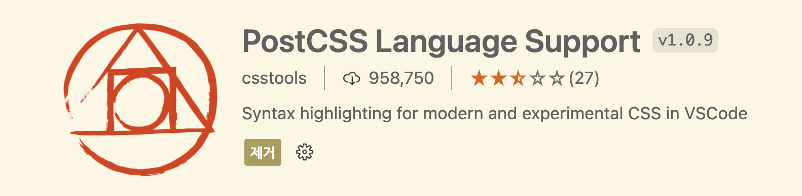
@tailwind utilities;@tailwind에 오렌지색 지렁이가 나오면
- vscode의 extension에서
- PostCSS Language Support 플러그인을 설치
style.css 파일을 App.js 파일에서 import
// src/App.js
import React from 'react'
import './style/style.css' // tailwind CSS 적용

const App: React.FC = () => {
    return <>(...)</>
}

export default App
tailwind.config.js 파일에서 테마 설정
//tailwind.config.js
/** @type {import('tailwindcss').Config} */
module.exports = {
    content: ['./src/**/*.{js,jsx,ts,jsx}'],
    plugins: [],
    theme: {
        screens: {
            sm: '480px',
            md: '768px',
            lg: '976px',
            xl: '1440px',
        },
        colors: {
            primary: 'red',
            secondary: 'skyblue',
            gray: {
                100: '#f7fafc',
                200: '#edf2f7',
                300: '#e2e8f0',
                400: '#cbd5e0',
                500: '#a0aec0',
                600: '#718096',
                700: '#4a5568',
                800: '#2d3748',
                900: '#1a202c',
            },
        },
        extend: {},
    },
}
- 사용
'Header.jsx' 파일에서 tailwind CSS 적용
// src/components/layout/Header.jsx
import React from 'react'

const Header = () => {
    return (
        <header className="flex items-center justify-between p-4 bg-gray-200">
            <h1 className="text-3xl font-bold underline ">Header</h1>
            <nav id="gnb">
                <ul className="flex gap-4">
                    <li className="text-primary">
                        <Link to="/">Home</Link>
                    </li>
                    <li className="text-primary">
                        <Link to="/about">About</Link>
                    </li>
                    <li className="text-primary">
                        <Link to="/login">login</Link>
                    </li>
                </ul>
            </nav>

            <div className="util">
                <Button primary>마이페이지</Button>
                <Button>장바구니</Button>
                {/* <GhostButton>로그인</GhostButton> */}
            </div>
        </header>
    )
}

export default Header
4. twin.macro
twin.macro는 tailwind CSS를 styled-components와 함께 사용할 수 있도록 도와주는 라이브러리입니다.
- 설치
// styled-components
npm install twin.macro styled-components
npm install -D @types/styled-components
npm install -D tailwind-styled-components

// babel-plugin
npm install -D babel-plugin-macross

yarn add twin.macro styled-components
yarn add -D @types/styled-components
yarn add -D tailwind-styled-components
yarn add -D babel-plugin-macross
- 설정 (안해도 될 수 있으니 우선 적용해보고 안되면 설정)
babelMacro를 사용하기 위해 babel-plugin-macros를 설정해야 합니다.
// babel-plugin-macros.config.js
module.exports = {
    twin: {
        preset: 'styled-components',
    },
}
package.json 파일에 babel-plugin-macros 설정을 추가합니다.
// package.json
"babelMacros": {
    "twin": {
        "preset": "styled-components"
    }
}
- 사용
tw 함수를 사용해 tailwind CSS 클래스를 적용할 수 있습니다.
// src/components/layout/Header.jsx
import { Link } from 'react-router-dom'
import tw from 'twin.macro'
import styled from 'styled-components'

const Header = () => {
    return (
        <HeaderWrap>
            <Logo>Header</Logo>
            <nav id="gnb">
                <ul>
                    <li>
                        <Link to="/">Home</Link>
                    </li>
                    <li>
                        <Link to="/about">About</Link>
                    </li>
                    <li>
                        <Link to="/login">login</Link>
                    </li>
                </ul>
            </nav>

            <div className="util">
                <Button primary>마이페이지</Button>
                <Button>장바구니</Button>
                {/* <GhostButton>로그인</GhostButton> */}
            </div>
        </HeaderWrap>
    )
}

const HeaderWrap = tw.header`
    flex items-center justify-between p-4 bg-gray-200
`
const Logo = tw.h1`
    text-3xl font-bold underline
`

export default Header
styled 함수를 사용해 Gnb 스타일을 정의할 수 있습니다.
// src/components/layout/Header.jsx
import { Link } from 'react-router-dom'
import tw from 'twin.macro'
import styled from 'styled-components'

const Header = () => {
    return (
        <HeaderWrap>
            <Logo>Header</Logo>
            <Gnb id="gnb">
                <ul>
                    <li>
                        <Link to="/">Home</Link>
                    </li>
                    <li>
                        <Link to="/about">About</Link>
                    </li>
                    <li>
                        <Link to="/login">login</Link>
                    </li>
                </ul>
            </Gnb>

            <div className="util">
                <Button primary>마이페이지</Button>
                <Button>장바구니</Button>
                {/* <GhostButton>로그인</GhostButton> */}
            </div>
        </HeaderWrap>
    )
}

(...)

const Gnb = styled.nav`
    ul {
        ${tw`flex gap-4`}
        li {
            ${tw`text-primary`}
        }
    }
`

export default Header
- 반응형 디자인
- tailwind CSS 반응형 클래스
tailwind CSS는 반응형 디자인을 쉽게 구현할 수 있도록 클래스를 제공합니다.
sm: 640px 이상md: 768px 이상lg: 1024px 이상xl: 1280px 이상2xl: 1536px 이상
// src/components/layout/Header.jsx
import tw from 'twin.macro'

const HeaderWrap = tw.header`
    flex flex-col items-center justify-between p-4 bg-gray-200
    md:flex-row
`
- styled-components 반응형 스타일
styled 함수를 사용해 반응형 스타일을 적용할 수 있습니다.
// src/components/layout/Header.jsx
import styled from 'styled-components'

const HeaderWrap = styled.header`
    display: flex;
    flex-direction: column;
    align-items: center;
    justify-content: space-between;
    padding: 1rem;
    background-color: lightblue;

    @media screen and (min-width: 768px) {
        flex-direction: row;
    }
`
- twin.macro 반응형 스타일
tw 함수를 사용해 반응형 스타일을 적용할 수 있습니다.
// src/components/layout/Header.jsx
import tw from 'twin.macro'

const Gnb = styled.nav`
    ul {
        ${tw`flex flex-col gap-4 md:flex-row md:gap-8`}
        li {
            ${tw`text-primary`}
        }
    }
`'Front > React' 카테고리의 다른 글
| [React style] chakra-ui theme 설정 (0) | 2024.04.13 |
|---|---|
| React로 웹사이트 만들기 (0) | 2024.04.05 |
| 리액트 ES6 문법 정리 - 기본편 (0) | 2024.03.29 |
| 리액트(React.js) 커리큘럼 (0) | 2024.03.24 |
| [Hooks] useContext - React 배우기 (0) | 2024.03.20 |